|

 For the first four years of its life,
Martins Bank’s Watford Branch is situated at Dudley’s Corner, Clarendon Road,
but in 1963 the call of the new sees the relocation of the branch to the new
angular, concrete and brick High Street.
The new Branch appears to be sharing its building with “Gilda”
fashions whose sign seems to fit in somewhat awkwardly below the Martins Coat
of Arms and signage. (We shall learn just exactly why the Bank has a new
bedfellow later on this page). For the first four years of its life,
Martins Bank’s Watford Branch is situated at Dudley’s Corner, Clarendon Road,
but in 1963 the call of the new sees the relocation of the branch to the new
angular, concrete and brick High Street.
The new Branch appears to be sharing its building with “Gilda”
fashions whose sign seems to fit in somewhat awkwardly below the Martins Coat
of Arms and signage. (We shall learn just exactly why the Bank has a new
bedfellow later on this page).
Maybe all this is too
much for Barclays, who close the branch in 1970, less than a year after the
merger. However, in more optimistic
times, the branch is heralded as another bold move for Martins Bank, and
colour images are taken of the interior to whet the appetite of the readers
of Martins Bank Magazine, who must surely wish that their own elderly North
of England branches might one day be quite so hip and trendy.
|
In Service: 1963 until 30 October 1970
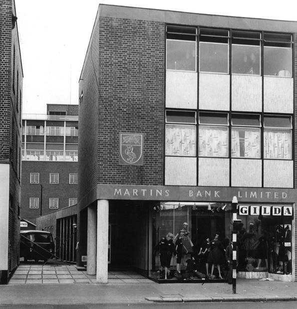
Image © Barclays Ref 0030-3092

|
|
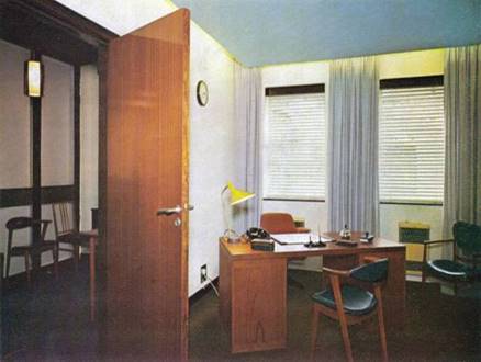
 Whilst some of Martins branches may have
come and gone, Watford included, the coat of arms is nevertheless still
visible to this day on the exterior brickwork. (See foot of this page). The
psychedelic writing desks and bright colour schemes of the interior, will
have to be left both to memory and photographic record. Later we have part of
an article printed by The Architect and Building News Magazine in September
1962 – it shows in fine detail just what goes into building and fitting out a
new Branch from scratch, but the story has an expensive twist. First of all
we go back to the Spring 1963 issue of Martins Bank Magazine, to learn how
customers and staff are enjoying life at their shiny new Branch at Watford… Whilst some of Martins branches may have
come and gone, Watford included, the coat of arms is nevertheless still
visible to this day on the exterior brickwork. (See foot of this page). The
psychedelic writing desks and bright colour schemes of the interior, will
have to be left both to memory and photographic record. Later we have part of
an article printed by The Architect and Building News Magazine in September
1962 – it shows in fine detail just what goes into building and fitting out a
new Branch from scratch, but the story has an expensive twist. First of all
we go back to the Spring 1963 issue of Martins Bank Magazine, to learn how
customers and staff are enjoying life at their shiny new Branch at Watford…
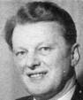
 We know from our own
observations and after talking to Mr. Beeby who opened our branch there in
temporary premises in 1959 that Watford is a thriving and active town. After
talking to both Mr. Beeby and his new second-in-command Mr. Catchpole we also
know that property prices are alarmingly high: whether this is due to an
appreciation that Watford is near enough to London for both work and play or
whether it is due to the apparent rigidity of the green belt which in other
areas is proving to be so disturbingly compressible we cannot say. We know from our own
observations and after talking to Mr. Beeby who opened our branch there in
temporary premises in 1959 that Watford is a thriving and active town. After
talking to both Mr. Beeby and his new second-in-command Mr. Catchpole we also
know that property prices are alarmingly high: whether this is due to an
appreciation that Watford is near enough to London for both work and play or
whether it is due to the apparent rigidity of the green belt which in other
areas is proving to be so disturbingly compressible we cannot say.
|
|
A further three things we know.
Our branch is every bit as striking outside as inside. Secondly, Mr.
Harry Beeby is not in the least dismayed at having fourteen branch banks in
Watford the largest of which has more than fifty on the staff. Thirdly, we actually visited the branch thus
convincing ourselves there is no jinx. Were Mr. Beeby anything but a
hard-headed son of the Manchester District he might have suspected that the
cancelled visits in the past four years were due to supernatural causes, but
early days at Waterfoot branch are not conducive to flights of fancy and
valuable experience over six years at Manchester District Office on a variety
of duties prior to becoming Clerk-in-Charge at Moss Side in 1956 have given
him an outlook and tenacity which enable him to overcome the disappointments
and frustrations of pioneering and to face facts.
|
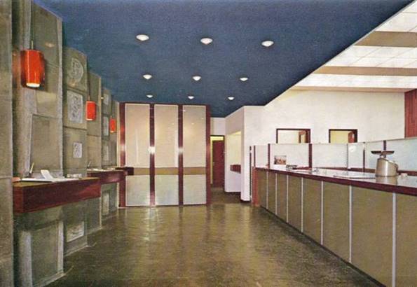
Image © Martins Bank Archive Collection

|
|
Mr. I. T. Mather is yet another 'displaced person',
his home being in Brighton where he entered the Bank in 1957. He has adapted
himself quickly to his new surroundings and duties and from what we saw and
heard at the counter we think he will soon have his own clientele among the
customers—a good
pointer to the future.
The two most fortunate members of the staff, whose
homes are already close by and who therefore have no wish to join the London
rush hour battle, are the young ladies—Miss S. Randolfi who entered the Bank in January 1962 and
Miss J. M. Guy who joined the staff in February this year.
As
we left for London we knew that our visit had delayed the work of these girls
but there was no hint of this in their farewell. By train or road one tends
to by-pass or go through Watford on the way to somewhere else. We are glad we
called there and we can assure anybody who takes the trouble to make a detour
that they will receive an equally warm welcome.
|
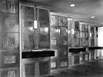
Image © Barclays Ref 0030/3092

|
|
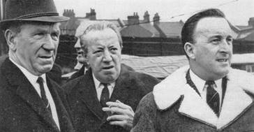  Assessing liquidity? Assessing liquidity?
A fluid
situation arose at Watford F.C. on January 28 when heavy rain
soaked the pitch on the eve of their match with Manchester United in the Cup
replay. Eric Press, our manager at Watford and a football referee, was called
in by the Football Association to examine the ground and he decided to call
off the game. And the worried faces with Mr Press? Of course, Sir Matt Busby
and his assistant, Mr Murphy.
|
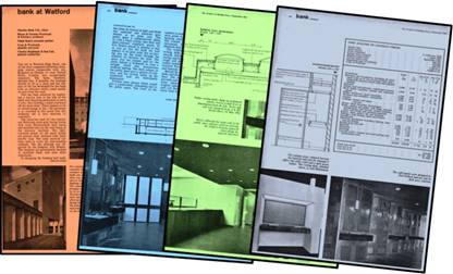
Building for the future?
The following extracts are
from The Architect and Building News, 5 September 1962. Many 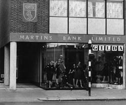 such articles are written about new branches of
many high street banks at this time. What makes this one historically
valuable is that it includes a complete cost analysis of the building and
equipping of Martins Bank’s Watford Branch, and that when these figures are
calculated at today’s prices, we see the enormous costs of setting up
business in Watford – which is actually compared with London’s Oxford
Street in terms of congestion and expense(!) In a novel approach to building a Branch
(for the 2017 equivalent of more than £812,000), Martins Bank decided to
share its new building with a shop and an upstairs showroom, as well as a
flat. With a tenant or two, the Bank
can make the building start to pay for itself. If you are wondering how the
Bank itself is accessed, all is revealed in the following article… such articles are written about new branches of
many high street banks at this time. What makes this one historically
valuable is that it includes a complete cost analysis of the building and
equipping of Martins Bank’s Watford Branch, and that when these figures are
calculated at today’s prices, we see the enormous costs of setting up
business in Watford – which is actually compared with London’s Oxford
Street in terms of congestion and expense(!) In a novel approach to building a Branch
(for the 2017 equivalent of more than £812,000), Martins Bank decided to
share its new building with a shop and an upstairs showroom, as well as a
flat. With a tenant or two, the Bank
can make the building start to pay for itself. If you are wondering how the
Bank itself is accessed, all is revealed in the following article…
|
|
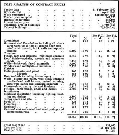
bank at Watford
Martins Bank Ltd., client.
Bryan & Norman Westwood
& Partners, architects.
Hugh Smart, associate partner.
Leon & Westwood, quantity
surveyors.
Charles Brightman & Son Ltd.,
general contractors
Tender date: 11
February 1960
Work started: 1 April 1960
Work completed: September 1961
|
|
|
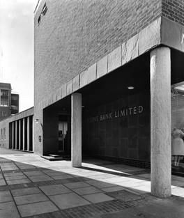
The site in Watford High Street, one of the most congested
suburban shopping centres comparable with, say, Kingston-on-Thames or even
Oxford Street, London, was exceptionally expensive. The bank, therefore, decided that, if possible, the frontage should be let
as a shop and the rear part of the site developed for the bank with an
entrance which could readily be seen from the road. This has been achieved by exploiting a
narrow lane at the side of the bank and obtaining permission to pave it
over, thus forming a small courtyard off the main street. There appears to be no disadvantage in
this; the pavement is so crowded at this point that this widening out is
very welcome to customers. The
materials used for the exterior are Hybroom silver-grey facing bricks with
riven Westmorland slate fascia and polished slate on the wall lining of the
entrance vestibule. The light-
coloured panels on the main façade are precast slabs surfaced with rustic
marble strip. The same material has been used to cover the free-standing
columns. The gilt lettering was
engraved by the sculptor, Eric Peskett. The windows are permanently finished
in anodized black and satin silver aluminium. In designing the banking hall itself, the
value of contrast in light and shade was exploited and materials gave
interest at no great cost. The
public space is comparatively dimly lit, with a black ceiling, slate floor
and dark-coloured sculptural panels by Eric Peskett placed in echelon so
that as you go into the bank the wall appears to be quite solid, but on
leaving you see the street through the windows set between the slabs. The space over the counter and for the
clerks behind is brilliantly lit from a laylight which also incorporates
artificial lighting.
|
sp3
|
|
|
|
The dark colours of the public space give a quality of richness, and
the writing tables on the sculptured wall are individually illuminated.
Finishes were chosen which would give a comfortable, welcoming feel to the
public space. The front of the counter is covered with Vyanide fabric, olive
green in colour, with a padded backing, neatly edged in aluminium. The counter top is a solid piece of Afromosia. The floor is of riven Delabole slate. The sculptured slabs between the writing
desks have in parts a very smooth shining surface obtained by casting against
glass and the insets are rough and dark.
They were cast in rubber moulds.
The ceiling is roughly textured Pyrok, dark grey in colour and
intensely sound-absorbing. Behind the
main counter, the clerks’ desks and drawers are finished in black bean. The
under bench fittings are movable and follow experience gained from planning
laboratories. This brightly lighted area has on the back wall rich dark brown
bean panel and black bean in random lengths.
|
 The images here are more than fifty years apart,
but there is of course one precious constant - Martins’ Bank’s coat of
Arms; but how many Twenty-First Century passers-by will know the
significance of this carving or indeed the other special features that were
incorporated into the design of this building at a cost in today’s money of
more than £85,000? The images here are more than fifty years apart,
but there is of course one precious constant - Martins’ Bank’s coat of
Arms; but how many Twenty-First Century passers-by will know the
significance of this carving or indeed the other special features that were
incorporated into the design of this building at a cost in today’s money of
more than £85,000?
|
|
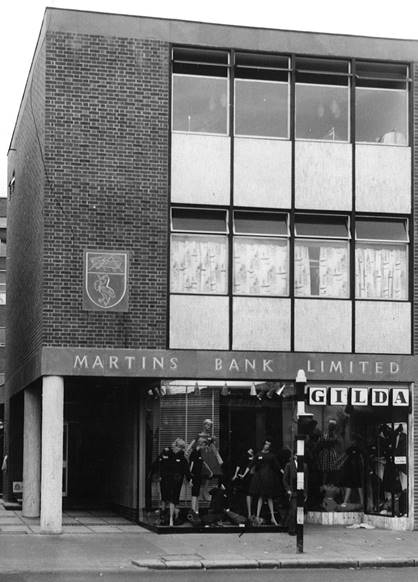
Image © Barclays Ref 0030-3092
|
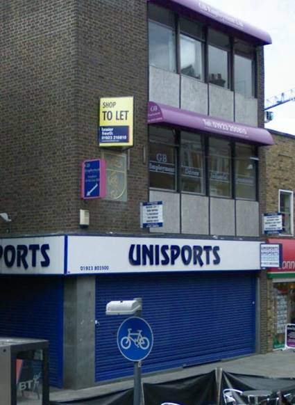
Image © 2010 Google Street View®
|
|

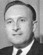
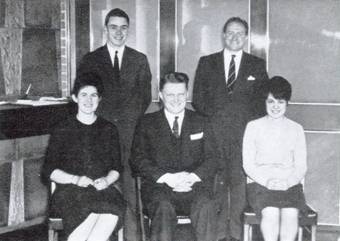 His
time both inside and outside the office is fully occupied and we were very
sorry that Mrs. Beeby was unable to join us for lunch at short notice owing
to the current production by the Women's Institute of a play in which Mrs.
Beeby was called upon to wear a beard! Mr. R. Catchpole had been at the
branch for only three weeks and was looking forward to the day when he could
bring his family from Southampton to join him, for he spent most of last
winter away from them in London on the Domestic Training Scheme. He entered
the Bank in 1944 and worked at Sittingbourne until called for National
Service. On his return he had a period on relief, returning to Sittingbourne
in 1949 and going to Southampton in 1955. The second position at a new branch
can never be a sinecure and Mr. Catchpole's experience and his approach to
his new duties were most encouraging.
His
time both inside and outside the office is fully occupied and we were very
sorry that Mrs. Beeby was unable to join us for lunch at short notice owing
to the current production by the Women's Institute of a play in which Mrs.
Beeby was called upon to wear a beard! Mr. R. Catchpole had been at the
branch for only three weeks and was looking forward to the day when he could
bring his family from Southampton to join him, for he spent most of last
winter away from them in London on the Domestic Training Scheme. He entered
the Bank in 1944 and worked at Sittingbourne until called for National
Service. On his return he had a period on relief, returning to Sittingbourne
in 1949 and going to Southampton in 1955. The second position at a new branch
can never be a sinecure and Mr. Catchpole's experience and his approach to
his new duties were most encouraging.